Saturday, 28 November 2015
Friday, 27 November 2015
Poster Progress Four
I decided to only have one main image on my poster rather than three images. I decided to do this as Photoshop did not have enough memory to carry on with the process I was using to make the images start to fade and disappear.
Using control and T, I made the image larger and centred it. I think this improved the look of the overall quality of the effect I created on the image.
Using control and T, I made the image larger and centred it. I think this improved the look of the overall quality of the effect I created on the image.
I then Merged all of the text layers on my credits and used control and T to enlarge the overall layer so that it was easier to read and so that it stood out more/
This is my final poster:
Wednesday, 25 November 2015
Poster Progress Three
I then began editing another photo for my poster. I used a similar process this time but tried it so that the fading away looked better.
I first got the image I wanted to use and deleted the background. I then copied the layers and moved one to the side and chose filter and then liquify.
I first got the image I wanted to use and deleted the background. I then copied the layers and moved one to the side and chose filter and then liquify.
Tuesday, 24 November 2015
Poster Progress Two
Now that I have some of the photos for my poster, I can start editing them and adding them to the poster. I started off by opening the image of one of the characters into Photoshop.
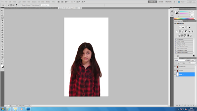
I decided that I wanted to make it look like the children on the cover were in the middle of disappearing as this fits the storyline of my trailer. To do this, I began with the quick selection tool to select the character from the background. I then used the refine edge tool so that it wasn't so solid and parts of her hair came back and the edges seemed smoother and less jagged. I then had to copy that layer and add a new layer and fill this in white using the paint bucket tool.
I then pressed ctrl with both layers to move them to the side, still on top of each other. I then selected filter and then liquify. This pulled the back layer.
After this, I had to add a layer mask to each of the layers with the image on and this covered the extension of the image. I then made it black and white using the image adjustments and I then began to rub parts out to make her seem like she was in the middle of disappearing. I then dragged this onto my poster so far and moved it to where I wanted it. I then pressed ctrl + t to make it the correct size.
This is my poster so far:
I then moved the title and image downwards as I thought the space underneath my title was too large. I now need to repeat process with the editing of the other two images of characters and add my tag line and my poster will be complete.
Friday, 6 November 2015
Poster Progress One
As I don't have the images for my poster yet, I began with the writing. This writing includes the main actresses at the top and the bottom credits. As for now, the background will stay back, mainly just so that the writing is visible. I used the 'SOLO' film poster layout as a basis for my own film poster. This is why my actresses names are situated where they are. I used the text tool and selected 'Niagara Solid'.
I then made my credits. I used various different posters credits to find out what I needed to include, for example, producer, director, writer etc. Once again I used the text tool on the 'Niagara Solid' font to create this. I then used the grid to centre it on the page. Underneath I included the logos for my production/distribution companies. I also had to use the magic eraser tool to erase the backgrounds from these logos. I also used the text tool in a different font to add the release 'coming soon'. I then incorporated the logo for the IMAX and 3D. I then groups these all together and used the grid once again to centre them. I also included the website here as this is a common convention of a movie poster.
I then added the title of my film. I used a font that I liked from 1001fonts and altered the size using ctrl + T + shift. This is not yet my decided font, I will not choose my final font for the title until my images in in so that I know how the overall product will look.
This is my poster so far.
Poster Questionnaire
Below I have posted my questionnaire for my poster, I created this so that I could find out what my target audience expect to see on a thriller film poster. Below that I have two example questionnaires that have been filled in.
Tuesday, 3 November 2015
Magazine Cover Progress Three
I then opened a new Photoshop document and changed the size and resolution of the document. I changed the size because the Little White Lies magazines are not A4 like most magazines, they are smaller. I made it 20cm x 24.5cm.
I then began creating the Little White Lies logo. I created a white circle and added a barcode around the top. In usual magazines, the barcode is at the bottom or side, that is why I chose this magazine as it is different and has a different style/look. I then found the font that matched online and added the letters to create the middle of the logo and used a different font for the issue number, price and date etc. I used a typewriter like font for this, I couldn't get the exact font so I used the closest possible.
I then added my main image by dragging the layer from one document to the other. I placed it almost central, slightly to the right as it looked better this way rather than in the centre.
I then made the ragdoll smaller and placed them around the main image, I rotated some and scattered them to make them seem as if they were falling down from the top. Like on the cover I based it on. It also relates to the plot of the trailer.
I then decided which font for the masthead that I liked the best, I played around and tried out a few but in the end, settled upon the font shown below.
I then used the brightness tool to make the overall cover look darker as it looked too faint.
Magazine Cover Progress Two
Out of the photos of my main character, I chose this one for my main cover. I chose this photo because her hair was not fully covering her face and it was my favourite facial expression.

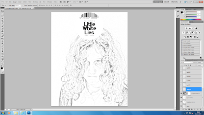
I opened my photo in Photoshop and began the process of making it look more like a sketched drawing. I separated the photo from the background to create a new layer. I also duplicated the layer.
I then used the colour dodge tool.
Using control + I, I inverted the photo. This made the page go completely white and the image wasn't visible. I then went on filter, then blur, then Gaussian Blur. I then took the saturation all the way down to zero. This made the image look like pencil drawing, like shown below.
I then carried out the same process again on the image of the ragdoll, rather than having feathers in the background like on the Little White Lies Magazine cover.
Subscribe to:
Comments (Atom)


