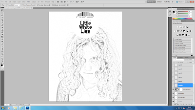
I then opened a new Photoshop document and changed the size and resolution of the document. I changed the size because the Little White Lies magazines are not A4 like most magazines, they are smaller. I made it 20cm x 24.5cm.
I then began creating the Little White Lies logo. I created a white circle and added a barcode around the top. In usual magazines, the barcode is at the bottom or side, that is why I chose this magazine as it is different and has a different style/look. I then found the font that matched online and added the letters to create the middle of the logo and used a different font for the issue number, price and date etc. I used a typewriter like font for this, I couldn't get the exact font so I used the closest possible.
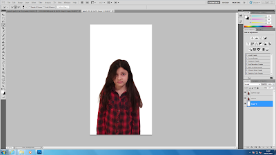
I then added my main image by dragging the layer from one document to the other. I placed it almost central, slightly to the right as it looked better this way rather than in the centre.
I then made the ragdoll smaller and placed them around the main image, I rotated some and scattered them to make them seem as if they were falling down from the top. Like on the cover I based it on. It also relates to the plot of the trailer.
I then decided which font for the masthead that I liked the best, I played around and tried out a few but in the end, settled upon the font shown below.
I then used the brightness tool to make the overall cover look darker as it looked too faint.


