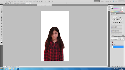
Now that I have some of the photos for my poster, I can start editing them and adding them to the poster. I started off by opening the image of one of the characters into Photoshop.
I decided that I wanted to make it look like the children on the cover were in the middle of disappearing as this fits the storyline of my trailer. To do this, I began with the quick selection tool to select the character from the background. I then used the refine edge tool so that it wasn't so solid and parts of her hair came back and the edges seemed smoother and less jagged. I then had to copy that layer and add a new layer and fill this in white using the paint bucket tool.
I then pressed ctrl with both layers to move them to the side, still on top of each other. I then selected filter and then liquify. This pulled the back layer.
After this, I had to add a layer mask to each of the layers with the image on and this covered the extension of the image. I then made it black and white using the image adjustments and I then began to rub parts out to make her seem like she was in the middle of disappearing. I then dragged this onto my poster so far and moved it to where I wanted it. I then pressed ctrl + t to make it the correct size.
This is my poster so far:
I then moved the title and image downwards as I thought the space underneath my title was too large. I now need to repeat process with the editing of the other two images of characters and add my tag line and my poster will be complete.


No comments:
Post a Comment